PS制作Google Chrome瀏覽器Logo圖標(biāo)(8)
來源:未知
作者:admin
學(xué)習(xí):14740人次
原文來自:AdobeTutorialz
翻譯:S.Shek
A detailed tutorial on how to create this awesome logo.
一篇詳細(xì)的教程教你如何制作一個漂亮的logo.
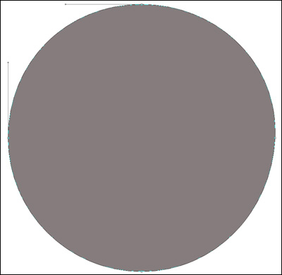
Begin working by creating a new file (File>New) of 854x854 px and 72 dpi. Use on it the Ellipse Tool (U) to represent the basis for the logotype to be of the Google Chrome browser.
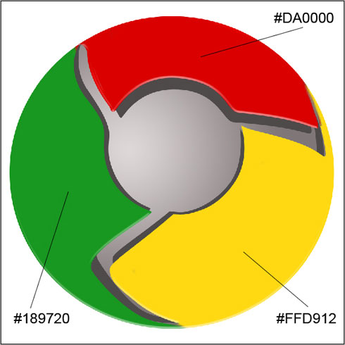
先新建畫布(文件>新建),大小854x854 px,分辨率72.用橢圓工具(U)畫出一個Google Chrome瀏覽器圖標(biāo)的底層(譯者:別忘了選定形狀圖層模式)
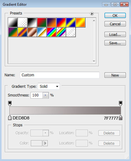
右鍵單擊此圖層,混合選項,圖層樣式中選擇漸變疊加
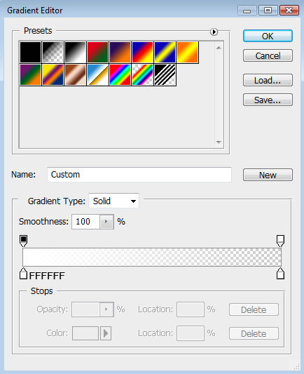
漸變設(shè)置如下(顏色:#DED8D8--#7F7777,樣式:徑向):
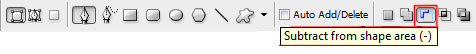
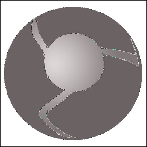
Using the same tool, try to make the next layer of the same element. Firstly apply the Ellipse Tool (U) to mark out the outside edges of the layer and then choose the Pen Tool (P) to cut out an inside opening. Its shape may be corrected with the Convert Point Tool.
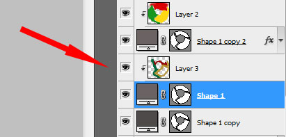
再用橢圓工具重復(fù)上一步驟,畫一個同樣的圓邊緣與之前的重合(譯者:或直接復(fù)制一層去掉圖層樣式),然后用鋼筆工具(P)在其內(nèi)部切出我們需要的形狀(譯者:選擇"從形狀區(qū)域減去"或按住Alt鍵),然后利用轉(zhuǎn)換點工具進(jìn)行調(diào)整
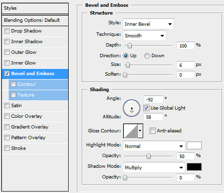
設(shè)置圖層樣式,選擇斜面和浮雕(參數(shù)如下)
將此圖層復(fù)制一份,使用自由變換工具,選擇保持長寬比,均勻的縮小圖層,去掉圖層樣式.選擇顏色#4E4A4A,然后把這個復(fù)制層放在原圖層的下方.這將作為陰影效果層
Create a new layer and use on it a standard brush (Brush Tool (B)) to paint the logotype sectors. Press preliminary Alt button and make a mouse click between the top logotype layer and the new one.
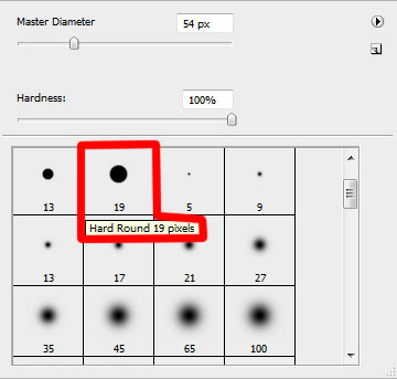
新建圖層,使用標(biāo)準(zhǔn)畫筆工具(B)為圖標(biāo)的表面扇葉部分上色,按住Alt鍵,再左鍵點擊新圖層和形狀圖層之間創(chuàng)建剪貼蒙版(具體參數(shù)如下)
把帶有斜面和浮雕效果的圖層復(fù)制一份,用轉(zhuǎn)換點工具改變一下它的形狀位置,去掉圖層樣式(斜面和浮雕),然后把它放在形狀層和陰影層之間
Create a new layer again situating it above the previous made one and do the same operations we did when painting the top layer (meaning the layer situated above the shadow layer, but lower than the logotype one).
再創(chuàng)建一個新圖層,重復(fù)之前給扇葉上色時的步驟,為上一步驟復(fù)制的形狀圖層上色,具體參數(shù)如下圖:
將為表面扇葉上色時的顏色圖層復(fù)制一份,使用加深和減淡工具畫上一些高光和陰影(如圖)
Using the Ellipse Tool (U), try to represent the central element of the logotype. Place its layer lower than the top layer of the logotype.
使用橢圓工具(U)在圖標(biāo)的中心畫一個圓形,將它放在頂層之下
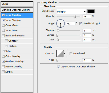
Blending Options>Drop Shadow
圖層參數(shù)設(shè)置為:填充:0%
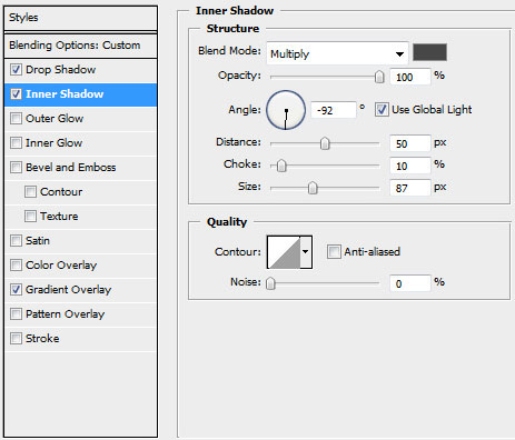
圖層樣式(參數(shù)如圖):
投影
內(nèi)陰影
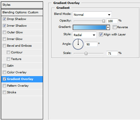
漸變疊加
Gradient parameters:
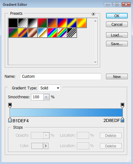
漸變設(shè)置如圖(顏色:#B1DEF4--#2D8EDF,樣式:徑向)
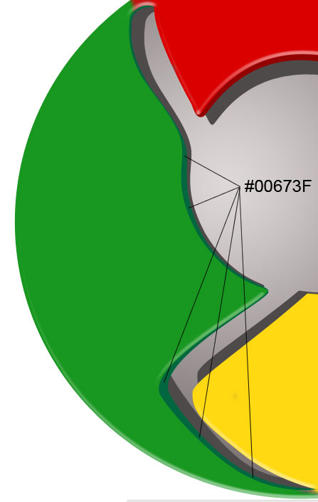
接下來試著在圖標(biāo)中心位置畫上環(huán)狀的高光,使用開始時的方法,用橢圓工具(U)畫上圓形路徑,然后按住Alt鍵進(jìn)行切割(如圖)
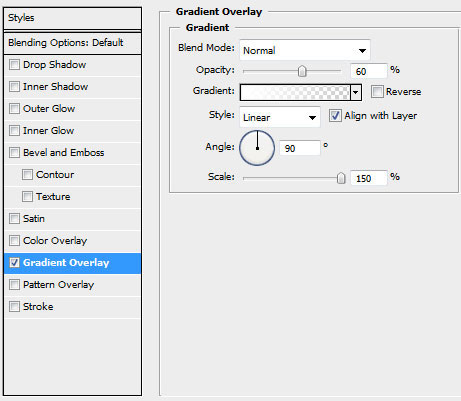
Blending Options>Gradient Overlay
圖層設(shè)置:填充:40%
圖層樣式:漸變疊加
Gradient parameters:
漸變參數(shù)設(shè)置
將圖層移至剛才制作高光陰影的那一層之上,按住Alt鍵點擊兩圖層之間,創(chuàng)建剪貼蒙版.
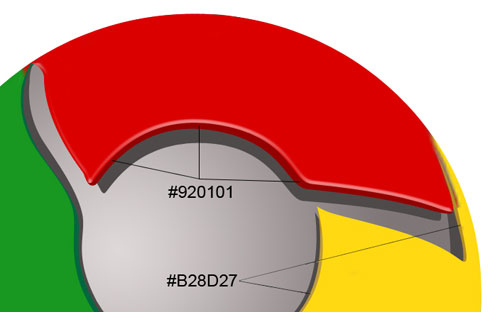
接下來這一步,我們將畫一道底部的高光,選擇橢圓工具(U),沿著圖標(biāo)的底部畫出高光的外邊,再按住Alt鍵清除掉不必要的部分,圖層顏色為白色
Blending mode-Lighter Color
圖層設(shè)置:填充:25%
疊加模式:顏色減淡
到這一步圖標(biāo)就完成了!
翻譯:S.Shek
A detailed tutorial on how to create this awesome logo.
一篇詳細(xì)的教程教你如何制作一個漂亮的logo.
Begin working by creating a new file (File>New) of 854x854 px and 72 dpi. Use on it the Ellipse Tool (U) to represent the basis for the logotype to be of the Google Chrome browser.
先新建畫布(文件>新建),大小854x854 px,分辨率72.用橢圓工具(U)畫出一個Google Chrome瀏覽器圖標(biāo)的底層(譯者:別忘了選定形狀圖層模式)
右鍵單擊此圖層,混合選項,圖層樣式中選擇漸變疊加

漸變設(shè)置如下(顏色:#DED8D8--#7F7777,樣式:徑向):

Using the same tool, try to make the next layer of the same element. Firstly apply the Ellipse Tool (U) to mark out the outside edges of the layer and then choose the Pen Tool (P) to cut out an inside opening. Its shape may be corrected with the Convert Point Tool.
再用橢圓工具重復(fù)上一步驟,畫一個同樣的圓邊緣與之前的重合(譯者:或直接復(fù)制一層去掉圖層樣式),然后用鋼筆工具(P)在其內(nèi)部切出我們需要的形狀(譯者:選擇"從形狀區(qū)域減去"或按住Alt鍵),然后利用轉(zhuǎn)換點工具進(jìn)行調(diào)整
設(shè)置圖層樣式,選擇斜面和浮雕(參數(shù)如下)

將此圖層復(fù)制一份,使用自由變換工具,選擇保持長寬比,均勻的縮小圖層,去掉圖層樣式.選擇顏色#4E4A4A,然后把這個復(fù)制層放在原圖層的下方.這將作為陰影效果層

Create a new layer and use on it a standard brush (Brush Tool (B)) to paint the logotype sectors. Press preliminary Alt button and make a mouse click between the top logotype layer and the new one.
新建圖層,使用標(biāo)準(zhǔn)畫筆工具(B)為圖標(biāo)的表面扇葉部分上色,按住Alt鍵,再左鍵點擊新圖層和形狀圖層之間創(chuàng)建剪貼蒙版(具體參數(shù)如下)
把帶有斜面和浮雕效果的圖層復(fù)制一份,用轉(zhuǎn)換點工具改變一下它的形狀位置,去掉圖層樣式(斜面和浮雕),然后把它放在形狀層和陰影層之間

Create a new layer again situating it above the previous made one and do the same operations we did when painting the top layer (meaning the layer situated above the shadow layer, but lower than the logotype one).
再創(chuàng)建一個新圖層,重復(fù)之前給扇葉上色時的步驟,為上一步驟復(fù)制的形狀圖層上色,具體參數(shù)如下圖:
將為表面扇葉上色時的顏色圖層復(fù)制一份,使用加深和減淡工具畫上一些高光和陰影(如圖)

Using the Ellipse Tool (U), try to represent the central element of the logotype. Place its layer lower than the top layer of the logotype.
使用橢圓工具(U)在圖標(biāo)的中心畫一個圓形,將它放在頂層之下

Blending Options>Drop Shadow
圖層參數(shù)設(shè)置為:填充:0%
圖層樣式(參數(shù)如圖):
投影
內(nèi)陰影
漸變疊加
Gradient parameters:
漸變設(shè)置如圖(顏色:#B1DEF4--#2D8EDF,樣式:徑向)

接下來試著在圖標(biāo)中心位置畫上環(huán)狀的高光,使用開始時的方法,用橢圓工具(U)畫上圓形路徑,然后按住Alt鍵進(jìn)行切割(如圖)

Blending Options>Gradient Overlay
圖層設(shè)置:填充:40%
圖層樣式:漸變疊加
Gradient parameters:
漸變參數(shù)設(shè)置

將圖層移至剛才制作高光陰影的那一層之上,按住Alt鍵點擊兩圖層之間,創(chuàng)建剪貼蒙版.

接下來這一步,我們將畫一道底部的高光,選擇橢圓工具(U),沿著圖標(biāo)的底部畫出高光的外邊,再按住Alt鍵清除掉不必要的部分,圖層顏色為白色

Blending mode-Lighter Color
圖層設(shè)置:填充:25%
疊加模式:顏色減淡

到這一步圖標(biāo)就完成了!
- 相關(guān)教程
- TA的教程
- 收藏
- 返回
- PS制作瀏覽器
- PS制作Logo圖標(biāo)
學(xué)習(xí) · 提示
關(guān)注大神微博加入>>


網(wǎng)友求助,請回答!