PS制作一個(gè)時(shí)尚網(wǎng)頁(yè)文件夾圖標(biāo)(3)
7. Next you turn the piece of paper to the left a little bit and put this layer under the layer with the 3D folder thing from step 4.
7,接著把這張紙向左旋轉(zhuǎn)一些,然后把這個(gè)圖層放在第四步的圖層之下.

8. That looks quite nice, but the thing wich makes it look like a really cool icon, is to set the opacity of the 3D folder part to about 50-60%.
8,現(xiàn)在看起來(lái)就漂亮多了,但是我們還可以讓它更酷一些,只需要把第四步的圖層的不透明度設(shè)置在50%-60%左右.

That's it. You can add some details and use it for a website or make an .ico file and use it for your desktop.
Thats what I came up with in the end:
就是它了! 你可以再為它增加一些細(xì)節(jié),然后用在你的網(wǎng)頁(yè)上,或者把它制作成.ico格式的圖標(biāo)應(yīng)用在你的桌面上.
下面就是我最后做出來(lái)的:

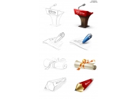
Two other things wich I made with exactly the same folder parts:
我在相同的文件夾上做出的另外兩種效果:


I hope you liked my first tutorial, and I'm looking forward to make another one soon!
Have fun!
- 相關(guān)教程
- TA的教程
- 收藏
- 返回
- PS制作
- ps時(shí)尚網(wǎng)頁(yè)
- ps文件夾圖標(biāo)
學(xué)習(xí) · 提示
相關(guān)教程